 跳到内容
跳到内容 
Do you feel uncertain when you stare at bland packaging ideas? That worry can slow down your brand’s growth.
I believe you can pick and adjust any color you want. You can select bright or subtle hues that align with your brand, and that helps your product stand out on store shelves.
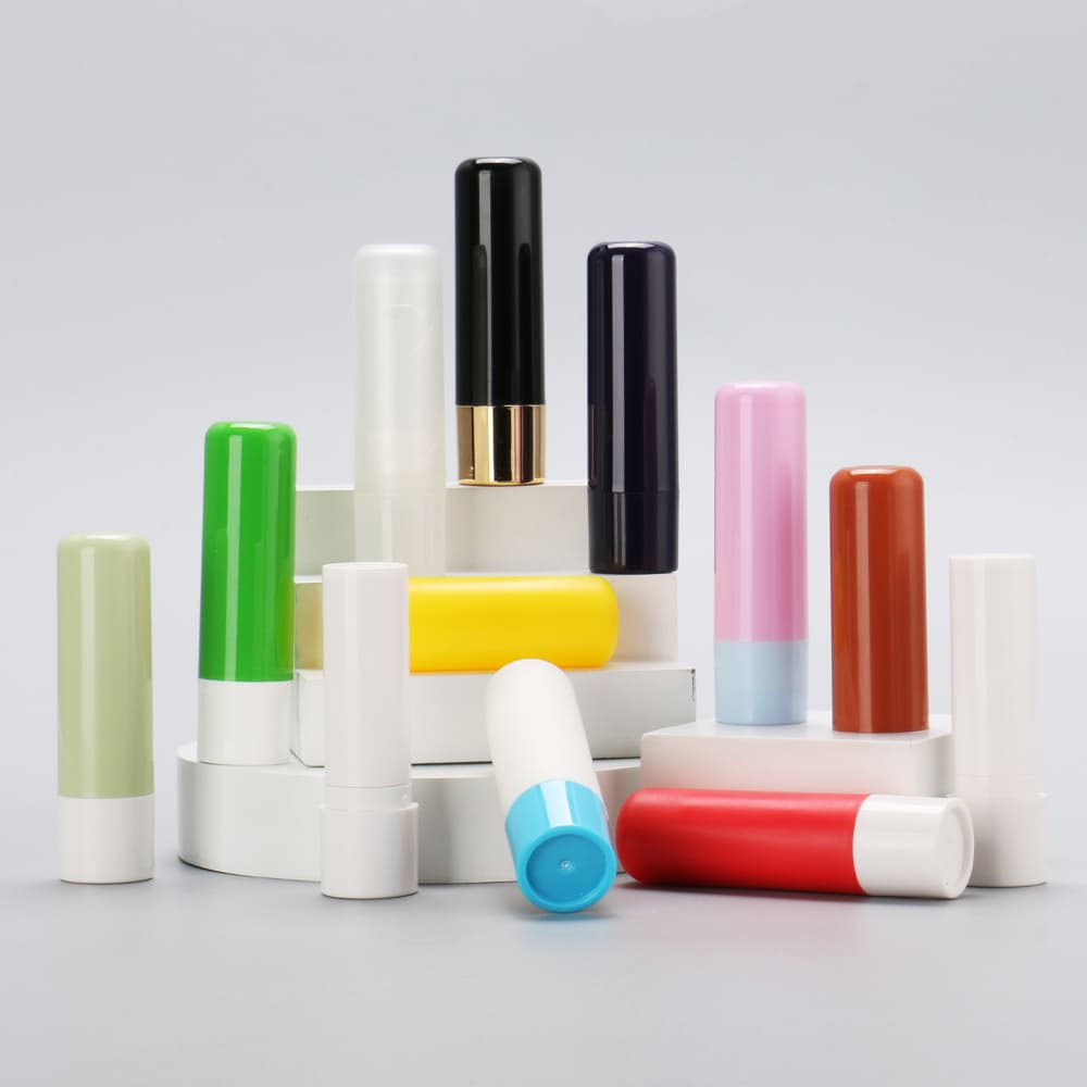
I once faced a tough choice when I started developing lipstick lines. I had a vague idea of a pastel blue tube, but I hesitated because I feared buyers might dislike it. I then realized custom colors help convey brand spirit, so I chose a final palette that matched my overall message. People said they loved the fresh and soft vibe. Let me share more details.
The Role of Colors in Cosmetic Packaging?
Do you sometimes feel that random color choices make your items look dull? That feeling can undermine your brand’s image.
I see a direct link between color selection and brand success. You can use color to shape perceptions, so your target audience feels attracted from the first glance.
I recall discovering that certain color palettes evoke distinct emotions. I once tested multiple bottle colors for a skincare line, noticing how warm pastels felt gentle, while bold primary shades projected energy. Now, I’ll explain how color influences cosmetic packaging.
Dive Deeper
Colors help shape the overall impression. This is true for first-time buyers who spot your product on a shelf, plus those who see it in a social media photo. People often respond to color before they read text or inspect brand details. Bright shades might suggest playfulness or youth, whereas darker hues might communicate mystery or elegance. A brand that aims for a natural or organic vibe might select earth tones or soft greens, so that message feels consistent throughout the product range.
I like to consider cultural associations. Many shades carry unique meanings in different areas. White can be linked to purity in some places, but it might convey mourning in others. Red might suggest love and passion, though in certain markets it can also tie in with festivals or traditions. If you plan to sell cosmetics globally, it helps to research how color resonates across your target regions. That step avoids confusion or negative reception. I worked with a friend who launched a skincare product in several countries. She picked a neutral beige tone that felt safe across many markets. That choice helped her avoid clashing with local color taboos or preferences.
Colors also communicate brand personality. If your brand is youthful and dynamic, you might incorporate vivid purples or neon pinks. A brand that caters to professionals might rely on sleek monochrome palettes, possibly black with silver accents. Colors become a silent extension of your brand story. When people see a display of your items, they link those hues with the mood you want to create. I once visited a trade show booth that used pastel pink and mint for all packaging. The brand’s entire setup gave off a gentle, soothing aura. Visitors remembered them because of that consistent color identity.
There is also a science behind color psychology. Some studies say certain hues can boost appetite or inspire calm. While cosmetics are not food, the underlying principle remains that color can evoke emotion. If you want your packaging to evoke excitement, you might lean on a bright color scheme. If you want serenity, you might choose cool blues or pale whites. This synergy between color and emotion can support your product positioning. Buyers often base snap judgments on these visual cues. By tailoring your packaging colors to your brand message, you can encourage users to form positive impressions right from the start.
Trends Of Cosmetic Packaging in China Are So Much About Color?
Do you feel curious why many Chinese cosmetic brands push bold or elegant tones? That confusion might lead you to miss key design insights.
I find that trends in China reflect cultural preferences for specific colors. You can follow these color patterns, or you can adapt them for an international audience.
I once worked with a business partner who sourced packaging from a factory in China. We noticed a surge in demand for minimalistic white containers, but also an uptick in gold finishes for premium lines. Let’s explore popular color choices in that market.
Black
Black is often linked with sophistication and mystery. In Chinese cosmetics packaging, black can signal a refined vibe, especially for brands that target mature or luxury segments. I once tested black jars for an anti-aging cream. Many customers described them as sleek and upscale. Black can also pair with metallic accents like gold or silver, which boosts the sense of opulence. Some see black as bold, so it works well for limited-edition lines that want attention.
I remember seeing black used in men’s grooming lines. It gave them a distinct edge, separating them from the bright pink or pastel packaging found in women’s cosmetics. Black jars, tubes, or bottles can exude a unisex feel if you keep the rest of the design simple. Another key factor is that black backgrounds can make a logo pop, especially if the logo is in white or metallic foil. That strong contrast draws eyes quickly. Men might view black as a sign of power or confidence, which helps them engage with products that promise performance or advanced formulas.
Black can pose challenges if you want a softer brand voice. Some feel it might appear too serious for cheerful or playful lines. If your brand is about cute packaging or whimsical designs, black might conflict with that message. However, I have seen creative ways to soften black. You might add pastel patterns on top or incorporate clear windows that reveal product colors. A brand that sells tinted balms might put them in black tubes but include a tinted cap, so the item does not feel too severe. Small design touches help you balance the boldness of black with the rest of the brand identity.
Culturally, black can have shifting connotations. In some contexts, it represents formality or solemn occasions. In others, it signals modern minimalism. If you plan to expand outside China, see how black packaging resonates in each region. Some markets might see black as elegant, others might find it harsh. If you do thorough research, black can be a powerful color that sets your product apart. You only need to coordinate it with the brand’s overall story. If done right, it can make an unforgettable statement on shelves, especially if you combine black with subtle gold text or intricate silver lines. That combination can convey high-end status with minimal effort.
Gold and Silver
Gold and silver can carry a sense of prestige, especially in China where gold often implies wealth or prosperity, and silver suggests a clean, modern vibe. I have experimented with gold-foil stamping on lipstick tubes. People found it eye-catching and said it hinted at a premium formula. Gold details on a black or white background stand out, which helps your product shine in a crowded marketplace. Some consumers also equate gold packaging with advanced skincare or high-luxury cosmetics, so you might raise your brand’s perceived value.
Silver packaging can feel modern or cool. I once saw a brand that produced silver cylindrical bottles for a haircare line, and they said it gave them a futuristic edge. Customers connected that metallic sheen with technology, believing the formula was innovative. If your brand wants to convey cutting-edge science, silver might be an ideal color. If you want to evoke tradition or prosperity, gold might fit better. In many Chinese celebrations, gold suggests good fortune, so pairing that hue with a holiday-themed cosmetic can encourage festive sales.
Gold and silver can pose design challenges. If overused, they might feel gaudy. Some brands solve that by using metallic hues in small accents. You might see a gold band around a bottle cap or a small silver brand mark on a tube. That subtle approach keeps the design refined. However, if you aim for full-on luxury, you might go all-out with gold surfaces. The risk is that too much glare or reflection can obscure text or make labels hard to read. If you want a consistent brand identity, you should test sample packaging to see if the metallic color complements your logo. In some cases, you might shift your logo’s color to white or black for legibility on a metallic background.
Cost is another factor. Achieving a good metallic finish can involve specialized materials or coatings. Foil stamping or vacuum metallization might be required. You should confirm that your packaging partner can produce the effect you want at scale. If you choose real metal components, that might drive up shipping weight. If you want a mere metallic look, you can use plastic with a glossy overlay or invest in aluminum parts. Each approach has a different price tag and level of durability. Some gold or silver finishes might scratch easily if you do not apply a protective topcoat. I once tested a cheaper gold spray on plastic jars, and we noticed scuffs after a short time. We then opted for a more robust plating method.
When used with care, gold and silver can position your cosmetics as top-tier. The shimmer or shine can draw immediate attention, plus it often connects with Chinese cultural ideals of fortune, prosperity, and celebration. Whether you adopt gold or silver as a dominant color or a subtle accent, you can craft packaging that feels special and stands out in a busy cosmetics aisle. Shoppers appreciate that sense of exclusivity, which might lead them to choose your brand for their next skincare or makeup purchase.
White
White can signal purity or cleanliness in many regions, and in China, it also has layered meanings. Some see it as minimalistic and fresh, which fits well for skincare lines or baby cosmetics. Others link white with solemn occasions, so you might need to think about how your brand angles its marketing. I have observed that white packaging can feel high-end if executed with refined typography and minimal distractions. A neat white bottle with a small brand logo might radiate that “less is more” approach, which resonates with fans of modern design.
I once helped a client create a line of facial cleansers in smooth white tubes. We added a subtle metallic accent on the cap, plus pastel text near the center. Consumers saw the packaging as clean and simple, which matched the product’s gentle formula. That synergy can build trust. People often associate bright white with clinical or spa-like results, which might appeal to an audience that values purity in skincare. White can make your brand appear sincere. If you pair it with soft color gradients or delicate patterns, you can keep it interesting without losing that crisp effect.
Still, white might pose practical concerns. Dirt or smudges show up easily on a white surface. If your product gets handled often or displayed in high-traffic areas, you might see scuff marks. Using certain coatings or finishes can reduce that issue. A matte white surface might look sleek, but it could cling to fingerprints. A glossy finish might repel marks, yet glare can hinder text readability under bright lights. Testing samples is important, so you do not end up with packaging that looks worn too soon.
Another challenge is standing out among similar products. Many skincare lines use white containers to express purity. If your brand decides on white, you may want to add a unique flair. That flair might be an embossed brand icon or an unexpected color splash on the label. You could also try translucent elements or subtle patterns that break up the white space. If you stay with a plain white approach, your product might blend in with every other minimalist brand. By adding small touches, you give shoppers a reason to pick up your product, see your brand name, and remember it later.
White can also adapt to seasonal promotions. If you produce a winter-themed moisturizer, a white tube might align naturally with a “snowy” concept. If you use the same packaging in summer, you can add bright stickers or an over-sleeve to refresh the look. That adaptability helps you switch marketing messages without overhauling the entire packaging line. In short, white is a flexible base color that can convey cleanliness or simplicity, but you need to balance it with your brand’s creative elements so it does not fade into the background. A thoughtful design approach ensures white packaging leaves a lasting impression, even in a competitive market.
Things To Consider When Selecting Custom Packaging Manufacturer for Cosmetics?
Do you feel worried that you might pick a supplier who cannot match your color goals? That concern can halt your brand’s progress.
I see that a systematic approach helps you find manufacturers who can fulfill your color, style, and material requirements.
I once collaborated with a small vendor who struggled to deliver consistent shades across multiple batches. That taught me to vet each partner’s capabilities in color matching, surface finishing, and production scale. Let’s look at key factors.
How The Process Works
When you decide on a custom packaging color, you should learn about how a factory implements that color. Some manufacturers start with raw resin that is pre-dyed, while others rely on post-production coatings or sprays. Each path can affect color accuracy and durability. I have seen brand owners order 10,000 units only to find the color slightly off from the sample. That mismatch can disrupt brand consistency. If you rely on a distinctive Pantone shade, confirm that your manufacturer can replicate it precisely. Ask for multiple samples or small trial runs before committing to a huge batch.
Factories might use injection molding for plastic containers. If so, they often add colorants directly into the plastic pellets. Once melted, the plastic emerges in your chosen hue. This method can yield uniform color throughout the item. Scratches may be less obvious, since the color is the same beneath the surface. However, you must check that the raw material is safe for cosmetic usage if your product comes into direct contact with the container. Some dyes might not meet regulatory requirements. Always ask about certifications.
Spray coatings offer another route. Here, the manufacturer produces a plain container and then sprays paint or a color layer on top. That approach can produce glossy, matte, or soft-touch finishes. However, it can chip if not sealed correctly. You should confirm if they apply a protective topcoat. I once used a matte spray on a line of lip gloss tubes. The brand loved the velvety feel, but we discovered the paint scratched off when tossed in a purse with keys. We had to add a protective layer, which solved the issue.
Metal components sometimes get anodized or plated for color. If you plan on metal caps or parts, see how the manufacturer handles plating. Cheaper methods might flake or tarnish, especially if they encounter moisture or oils. High-end plating can produce a stable finish that lasts. Also, metals can weigh more, driving up shipping costs. That might matter if you are balancing budgets. Plan ahead for any extra shipping or import fees.
Communication is crucial. A reliable supplier should offer color swatches, test samples, and confirm your final sign-off. If they rush you or skip proofing, that is a red flag. By understanding the steps, you can watch for potential pitfalls. This knowledge helps you pick a manufacturer that aligns with your brand’s color vision, so you do not face unwelcome surprises once production begins.
Consider Extended Gamut printing
Extended gamut printing is a process that uses more ink colors than standard CMYK. Some printers add extra hues like orange, green, or violet. This expansion can help produce brighter or more accurate colors, especially if your brand palette includes vivid neon or subtle pastel. I recall talking to a packaging supplier who used a seven-color system. Their wide color range allowed them to replicate complex brand designs better than a basic four-color press. If your packaging design includes unique color transitions or a wide tonal range, extended gamut might be worth exploring.
However, extended gamut might cost more. The brand must decide if that price jump is justified by the visual impact. High-end cosmetics sometimes rely on bold color to stand out, so the extra cost could pay off. Others prefer simpler designs that do not demand advanced printing. If your brand identity thrives on vibrant visuals, it can set you apart in a crowded market. On the other hand, if your designs are minimal, you might not need the complexity of extended gamut. That choice comes down to how color-critical your brand is.
There’s also a learning curve. Designers must know how to create files that work well with extended gamut. If your designer expects a standard CMYK workflow, they might not optimize the color profiles for the extra inks. That could result in off-hue prints if you are not careful. Always communicate with the manufacturer’s prepress team. They can guide your designer so the final product meets your color expectations. They might ask for test prints or digital proofs. A bit of collaboration can prevent surprises, such as oversaturated areas or mismatched gradient transitions.
Extended gamut also ties in with modern printing technologies. Some lines combine offset printing for main design elements, then add specialized coatings or foil stamping. If your brand wants to highlight a color-blocked design with a metallic accent, advanced printing can integrate all these features. That synergy might produce packaging that wows potential buyers. However, you need to confirm the manufacturer can handle each step seamlessly. If they outsource foil stamping, but do extended gamut in-house, timing or color consistency might vary. A single vendor who manages everything might ensure smoother results.
If you aim for uniform color across multiple product lines, extended gamut can help. The more refined color mixing can keep your brand palette consistent on bottles, boxes, and promotional materials. That consistency builds brand recognition. People see the same teal or peach hue across your entire range. Over time, that memory fosters loyalty. Extended gamut might not be mandatory for every brand, but it is a powerful tool if color precision and vibrancy drive your marketing strategy.
Understanding Surface Technology and Materials
Different surface technologies can impact color, shine, and texture. If you want a glossy look, the supplier might apply UV varnish or a high-gloss coating. If you want a matte feel, they might use a special resin or sanding process. Each choice affects how color appears. I tested two versions of the same bright pink on a bottle. One had a glossy finish, making the pink seem bold and almost neon under store lighting. The other was matte, giving a subdued pink that felt sophisticated. Both used the same base color, but the finish shifted the visual effect significantly.
Some packaging materials also influence how color is perceived. A translucent PET bottle might soften color because light passes through. An opaque HDPE container might make the color appear denser. Glass can produce a more luxe vibe, but the color might look different if you apply it on the outside or if the glass itself is tinted. When selecting a supplier, ask how they handle color on each material. If you plan multiple product lines with varying materials, consistency can be tricky. A brand might use glass for serums, plastic for lotions, and metal for special edition sets. Each material might interpret the same color differently, so you must align carefully.
Below is a table that shows some surface technologies and related effects:
| Surface Technology | Key Effect | Best For |
|---|---|---|
| UV Varnish | High gloss, scratch resistance | Bright or bold brand designs |
| Soft-Touch Coating | Velvety feel | Luxury or comforting user experience |
| Metallic Finish | Reflective shine or brushed look | Premium lines or futuristic themes |
| Frosted Surface | Cloudy, elegant vibe | Minimalist or spa-like products |
| Embossing/Debossing | Tactile brand logos | Emphasizing brand icons |
If your brand story revolves around eco-friendliness, you might ask about biodegradable or recycled materials. Those might limit certain coatings. For example, a heavily lacquered finish might reduce recyclability. Some eco-conscious brands choose minimal finishing. They might rely on simple direct printing or a single color. That can still look appealing if the design is thoughtful. Another factor is how your surface choices affect label adhesion. If you plan to apply stickers or shrink sleeves, certain textured surfaces might not hold them well.
Also think about user experience. A slick surface might look stunning in photos, yet it could be slippery in a shower setting. A coarse or matte texture might feel more secure. I recall a shampoo brand that used a matte bottle with slight grooves, so it was easy to hold with wet hands. That decision was practical, but it also influenced how the color read under bathroom lighting. Everything ties back to user needs. If the brand wants a product that stands out on social media, a glossy finish might be perfect. If the brand wants daily usability, a more functional texture can boost user satisfaction. A good packaging partner guides these choices, ensuring your final containers align with brand, function, and aesthetics.
Nearly 85% of Buyers of Cosmetic Items Make Choices Based on Package Color?
Do you feel surprised that so many decisions hinge on color alone? That shock might push you to rethink design priorities.
I see color as a vital tool. It can generate immediate attraction, and it might shape a buyer’s perception of quality or style.
I recall reading data that most shoppers experience an emotional response to packaging colors quickly. That sparks curiosity or forms trust. Let’s dig into why color sways so many cosmetic choices.
Dive Deeper
Color is often the first thing buyers notice when they scan a row of products. They might glance at shape or brand name after. This quick visual impact can lead them to pick one product over another. If your brand color stands out or resonates with them personally, they might investigate further by reading labels or checking price. If your packaging color looks dull or mismatched, they might skip it. This dynamic is especially strong in cosmetics because people view makeup or skincare as an expression of personal style.
Emotional cues are tied to color. A warm pink or a gentle lavender might evoke calm or comfort, which suits lotions or bath products. A vibrant red might stir excitement, fitting for bold lipsticks. A metallic silver or gold might suggest luxury. That immediate emotional reaction can override a buyer’s rational process. They think, “This color feels right,” or “This seems high-end.” That gut feeling can be enough to spark a purchase if your formula and brand story align with that color choice. On the other hand, an unappealing color might send the wrong signal. If your brand says “relaxing spa experience,” but your packaging is an aggressive neon, you might create confusion.
Cultural background plays a role too. Colors that thrive in one market might flop in another. For instance, I have seen Western brands adopt bright pink or teal, which appeals to young audiences locally, but might be viewed differently in regions where muted tones are preferred. If your brand sells worldwide, you might craft separate packaging versions that cater to local tastes. That might be a bigger investment, but the payoff is that each target audience sees a color palette they find inviting. Some global brands pick a main color that travels well, such as a gentle pastel or universal white, then add small local accents. This approach combines consistency with customization.
Brands also thrive on color synergy. If you have multiple product lines, tying them together through color-coded packaging can unify your shelf presence. A brand might use a single accent color across all items, or a color family that transitions from light to dark. This approach helps repeat customers spot your brand quickly, even if the product names differ. Over time, that visual signature becomes integral to brand identity. People remember your brand for that hue or color combination. This recognition can lead to loyalty, especially if the formula meets their needs. In short, color is not just a surface detail but a strategic choice that can guide a shopper from casual browsing to a confident purchase.
Conclusion
I see that color is a powerful tool for cosmetic packaging, so deliberate choices can help your brand connect with audiences and build lasting impressions.