 跳到内容
跳到内容 
Do you notice a gap when folks glance at your brand on shelves? That missing spark might leave them unenthused.
I make iconic packaging by mixing fresh design concepts with production expertise. A polished look stands out among competing products. This approach involves thoughtful materials, appealing colors, and shapes that match brand identity.
I often see beauty entrepreneurs who crave presence within crowded storefronts. That aim requires memorable packaging. I have experimented with shapes and finishes, then discovered that subtle details send big messages. Shoppers hold that container, notice its shape, and reflect on brand vibe. Many product lines fade into background if they lack sparkle. I prefer bold designs that match consistent brand themes. I also watch how small touches, such as tinted caps or embossed text, shape impressions. I want every client to feel assured that visitors will pause and take a second look. A lip gloss container shapes user perception from first sight. With that in mind, let me outline deeper factors.
The Importance of Iconic Lip Gloss Tubes?
Do you worry that bland containers might undermine brand recognition? That nagging doubt can slow product success.
I see a direct link between striking packaging and brand growth. It helps create a unified vibe, plus sparks user interest at first glance.
Setting the Stage for Brand Recognition
Brand recognition often starts with an eye-catching object. Packaging shapes those initial moments. I noticed that color, shape, and surface details project an immediate tone. At one point, I worked with an acquaintance who owned a cosmetics booth at a local fair. She placed plain tubes on a display rack. Folks walked past them without much curiosity. Then she tried a fresh approach: gold-flecked finishes on curved cylinders. She also placed a subtle brand mark near each cap. Foot traffic spiked almost instantly. That scenario showed me how a small tweak can capture attention.
Packaging Can Make or Break Your Product
I have seen brand owners who poured resources into product formulas, yet neglected packaging. That mismatch often impacts sales. I believe quality product deserves an appealing container. Buyers sometimes judge items by outside elements. If a tube looks cheap, folks might wonder about product efficacy. On the other hand, refined packaging implies care and detail. My friend once tested two packaging variants at a pop-up event. The formula inside remained identical. One had a translucent green case with a crisp brand logo. The other used a random plastic tube. The premium version sold out fast. That confirmed my suspicion: visual signals matter a lot.
Below is a quick reference table that outlines some reasons distinctive packaging can elevate brand image:
| Factor | Impact on Buyers | Long-Term Outcome |
|---|---|---|
| Color Consistency | Helps buyers link hue with brand ethos | Strengthens brand recall |
| Durable Materials | Conveys quality and trust | Encourages repeat orders |
| Unique Shapes | Makes product memorable at a glance | Boosts word-of-mouth buzz |
| Clear Brand Markings | Reinforces authenticity | Creates loyal following |
| Premium Finishes | Suggests careful craftsmanship | Elevates perceived value |
I see how brand building involves more than formula or fragrance. It’s about every aspect of experience. A brand story often resonates when consistent themes run across product range. That requires synergy between design, color palette, and brand promise. People like product lines that reflect stable messaging. The container is a direct extension of brand voice. I know some might question budget constraints, but creative solutions exist. Even a smaller business can pick packaging details that stand out without overspending. A glossy accent or a well-placed brand mark can transform a plain tube into a signature item.
I sometimes remind smaller vendors that brand recognition grows with consistent design cues. A simple color band or an unmistakable shape can imprint brand identity in someone’s mind. Over time, loyal shoppers spot that familiar style, even from a distance. That recognition leads to trust and repeated purchases. People often share items they love, which means packaging can become a conversation starter. I recall a boutique that placed metallic swirl patterns on lip gloss caps. Shoppers asked employees about that pattern. It became a talking point on social media. Comments poured in about how that swirl reminded folks of starry nights. That organic buzz arrived simply because the brand took a risk on a unique detail.
I consider packaging a stage for brand storytelling. It helps shape emotional connections with the shopper. Brand story flows through typography, color scheme, overall shape, or even the tactile feel of a tube’s surface. When that story resonates, folks feel drawn in. Many times, they share positive sentiments with friends or on social media. That sets a cycle in motion. People see a design, associate it with a positive vibe, and become curious about product performance. Next time, they might pick that brand from a crowded display. The small expense of investing in a thoughtful design can yield multiplied returns.
Iconic packaging remains a magnet for brand success. I keep reminding creative teams: never ignore a container’s role in shaping user impressions. People often buy what sparks interest, then remain loyal if product quality aligns with packaging promises. That synergy fosters brand advocates. So, let’s see how concept creation unfolds for lip gloss packaging in a more direct sense.
The Best Ways to Generate Lip Gloss Packaging Concepts?
Do you wonder which approach sparks fresh packaging ideas? That worry might stall your design process.
I find that brainstorming sessions plus user feedback can yield strong concepts. I bring real data, visual references, and brand voice points together.
Targeting Your Audience: The Key to Success
I usually start with a deep look at buyer persona traits. Maybe they favor vibrant patterns, or possibly lean toward minimal lines. I recall a workshop I led where folks surveyed daily makeup users. We discovered that younger buyers often crave bright pops of color, whereas a mature crowd prefers muted tones. That difference shapes packaging direction. Analyzing tastes can cut design guesswork. If your brand aims for teens, a neon gradient might gain traction. For professionals seeking subtlety, a refined monochrome approach could shine.
I want brand owners to see how buyer preferences guide shape, color, or even labeling language. Some target markets might respond to playful phrases or whimsical imagery. Others might prefer classy typography and understated designs. A brand that tries to please everyone often loses focus. That’s why targeted packaging resonates better. I encourage every new collaborator to define their core audience in detail. Are they social media influencers? Are they budget-conscious shoppers or luxury seekers? Once that target emerges, packaging concepts align more naturally.
Below is a small table that highlights factors related to audience targeting:
| Factor | Approach to Consider | Example |
|---|---|---|
| Age Range | Bold vs. Subtle Color Schemes | Neon for teens, neutrals for older users |
| Price Positioning | Premium vs. Affordable Finishes | Matte metallic vs. standard plastic |
| Lifestyle Preferences | Active vs. Formal Branding | Sweat-resistant or elegant appearances |
| Cultural Influences | Possible Iconography or Local Trends | Floral designs or geometric shapes |
| Social Media Presence | Shareworthy Packaging Angles | Insta-friendly shapes or unique caps |
I try not to overcomplicate. A straightforward path includes listing your top buyer segments, then matching each segment with color or shape clues. That step narrows concept exploration. I also watch brand mission statements. If a company champions minimal waste, that direction can inform packaging choices. A consistent approach fosters trust and ensures designs line up with brand beliefs. I once collaborated with a small brand that cared about eco-minded solutions. We tested biodegradable inserts and used muted earth tones. Their customers loved it. That synergy between brand story and packaging approach boosted loyalty.
Analyzing Current Trends in Lip Gloss Tubes
I keep an eye on real-world influences. Fashion shows, pop culture, or social media challenges can spark fresh ideas. Some creators experiment with gradient color layers on tube exteriors, or metallic stripes that match seasonal palettes. It helps to note that trends shift. A style that resonates this quarter might fade soon, so I emphasize timeless elements. But it’s still possible to incorporate subtle references to what’s popular now.
I recall a client who wanted high-impact illusions on each tube. Their designs featured swirling color blends that changed under different lighting. That approach drew hype because it felt new. However, I also advised them to keep a classic brand logo in a consistent spot. That anchor gave shoppers a stable brand link. A brand can adopt trends without losing its identity. The key is balancing novelty with something that remains recognizable.
I try to gather input from folks outside my bubble. That might include non-industry contacts who can offer unbiased impressions. A friend of mine once pointed out that heavy glitter designs felt dated. I realized that certain markets might see them as juvenile. Through outside feedback, we pivoted toward reflective metallic patterns that felt more refined. That shift helped align the brand’s image with a broader demographic.
I think it helps to track competitor packaging too. By checking shape variations or color combinations that dominate store shelves, one can find gaps. Maybe nobody is producing a slender rectangular tube with a matte surface. That might be your brand’s differentiator. Or perhaps angled applicator tips are rare in your region, so your product could introduce them. Gathering references fuels design brainstorming. Then careful selection ensures each element links back to brand essence.
When concepts are formed, I gather them in a mood board. That step helps visualize all possible directions. Then I highlight the best angles. Next, prototypes test feasibility. Some shapes might demand specialized molds or heavier materials. If budget constraints appear, we refine. In the end, you get a concept that merges brand voice with workable production steps. That synergy paves the way toward a stand-out presence in store aisles and online shops.
The Key Factors Influencing Lip Gloss Packaging?
Do you struggle to pick materials or shapes? That hesitation might block progress.
I consider function, cost, and brand identity. That helps me decide how tubes look and feel.
The Role of Materials in Lip Gloss Tubes
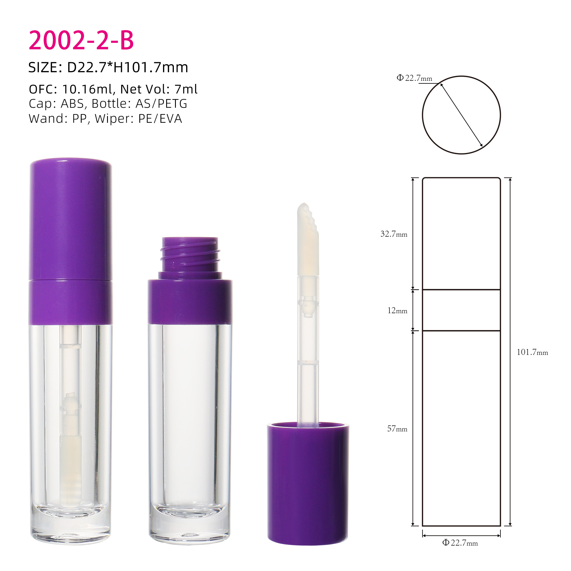
Selecting a base material involves more than visual appeal. It also impacts weight, durability, and cost. I have seen how certain materials appeal to upscale buyers, while others suit budget-friendly lines. Some prefer a plastic tube that feels light, whereas others want glass for that premium heft. I weigh factors like shipping risk or potential breakage. Glass can be heavy and fragile, but it often looks deluxe. Plastic might appear cheap, yet advanced resins now provide polished finishes. Metal can add a distinctive sheen, but cost might rise.
Different Materials – Plastic, Glass, and Metal
Plastic remains common because of its versatility. It’s lighter, so shipping costs tend to be lower. It often offers easy customization with dyes, embossing, or special coatings. Glass suits a refined look. It has that crystal-like clarity. I recall a brand that specialized in botanical gloss formulas. Glass containers reinforced their natural vibe. Metal might exude a modern, edgy style. I once saw lip gloss housed in a sleek aluminum case with laser-etched text, which felt futuristic. Each material has pros and cons:
| Material | Pros | Cons | Brand Fit |
|---|---|---|---|
| Plastic | Lightweight, cost-friendly, flexible | Possible less premium feel | Mass-market segments |
| Glass | Upscale look, clarity, solid feel | Heavier, breakable, higher shipping | Luxury or niche |
| Metal | Sleek, modern surface, durable | Costly, might show fingerprints | Futuristic or bold |
That table summarizes my observations. I caution brand owners to test multiple samples. A certain plastic might look sophisticated under bright light, yet scratch easily. Glass might chip if dropped. Metal might dent under rough handling. We weigh those factors. Then we match them to brand position. Smaller lines might prefer a lower base cost. Meanwhile, a prestige brand might see justification in paying more for that weighty glass feel.
Demands for Eco-Friendly Packaging Materials are Rising
I notice a surge in requests for recycled or biodegradable packaging. Some folks want tubes created from ocean plastics or post-consumer resin. That approach can help connect with conscientious buyers. However, production processes might be more involved. I have helped brands source plant-based materials. They often need specialized manufacturing lines. The payoff is loyalty from shoppers who value minimal carbon footprints. I tested a recycled plastic concept with a local retailer. They got positive reactions at a trade fair because more people appreciate greener choices. I think it’s wise to evaluate your target group. If they place high value on eco-minded solutions, that angle can boost brand standing.
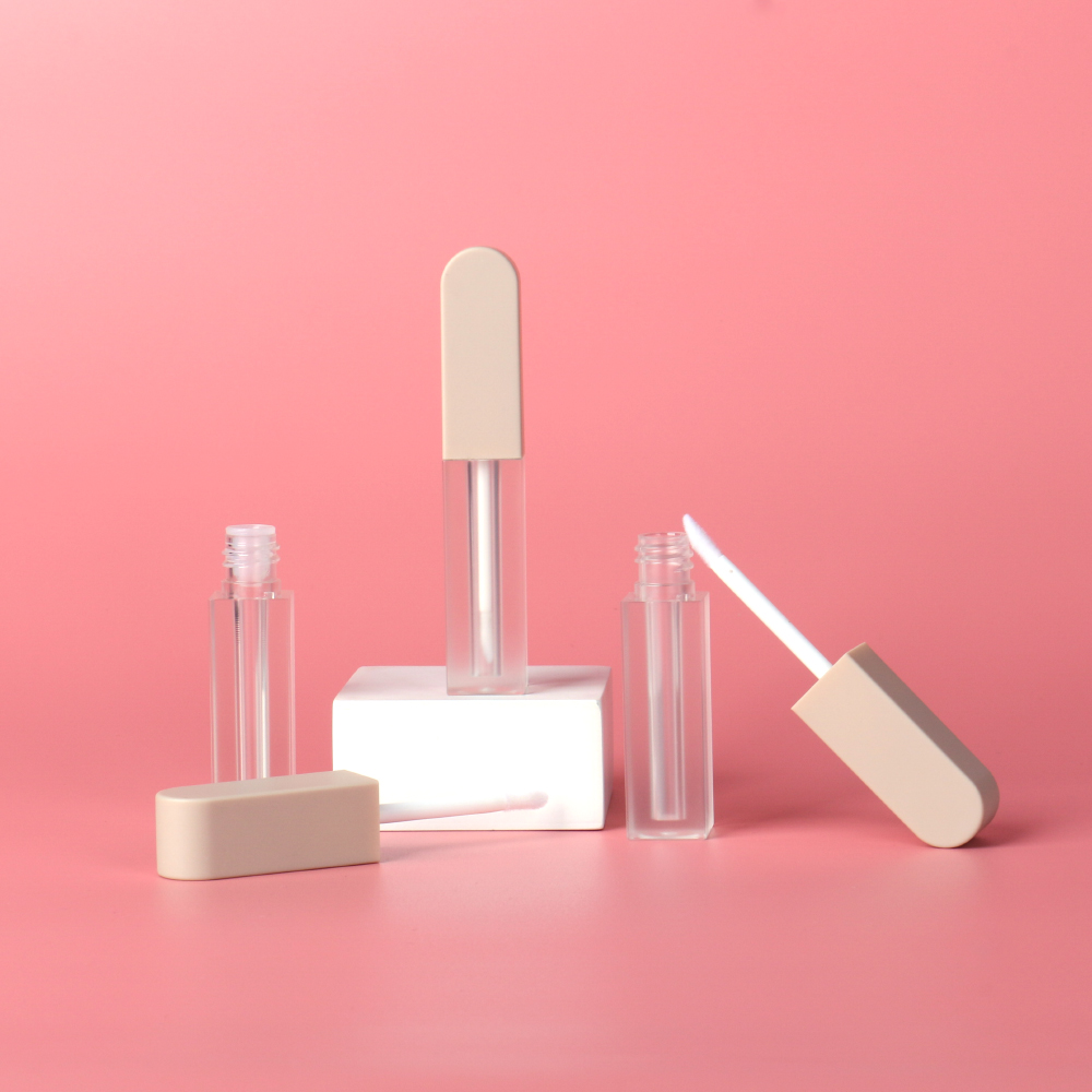
Crafting the Perfect Shape for Your Lip Gloss Tubes
Shape can spark immediate curiosity. I recall a scenario where a brand launched triangular tubes. That design stood out in photos and on shelves. People recognized it quickly. I see shapes as more than an aesthetic choice. An ergonomic design might let users grip the container comfortably. Some people like slender tubes that slide easily into small purses. Others prefer chunkier shapes that feel substantial in hand. There’s a balance between creativity and practicality.
Exploring Standard vs. Custom Shapes
Standard molds are more budget-friendly. They are widely available and easy to order in bulk. That is helpful for smaller businesses or those focusing on stable designs. I suggest custom shapes when brand identity needs something beyond typical cylinders. A friend created a shape resembling a short rectangle with slanted edges. That silhouette matched her brand’s edgy persona. Custom shapes might require higher upfront costs due to mold development. Production runs often must meet minimums to offset tooling expenses. Still, that uniqueness might pay off. I have seen brand owners recoup those costs through brand differentiation.
Below is a table that outlines shape considerations:
| Shape Option | Pros | Cons | Recommended For |
|---|---|---|---|
| Standard Cylindrical | Low cost, widely available, familiar | Less distinctive, easy to copy | Mass-market or budget lines |
| Square or Rectangular | Unique geometry, stands out | Possibly higher production complexity | Mid-range or edgy concepts |
| Curved Custom | Eye-catching, brand-specific | Higher tooling expenses | High-end or signature ranges |
I remind partners to think about brand theme. A square shape might align with a minimalist brand that loves clean lines. Meanwhile, swirling silhouettes might suit playful or romantic brands. Testing prototypes with potential users can confirm if shape decisions match user comfort. That feedback loop is helpful. People might find certain shapes awkward. A brand shouldn’t finalize a shape without that input. It’s better to adjust early than face returns or complaints later.
How Different Shapes Influence Consumer Perception
Shoppers form impressions in seconds. A slender, elongated tube might communicate elegance. A short, stout one might project fun vibes. I encountered an influencer who always showcased her curved tubes on social media. She said they felt comfortable and matched her breezy brand persona. Another brand chose a blocky shape to match a “bold confidence” theme. Each approach can succeed if it aligns with brand storytelling. I enjoy seeing creative leaps. Some owners fear that novelty might alienate folks. In my experience, an odd shape can become a talking point and earn media attention, as long as it stays user-friendly.
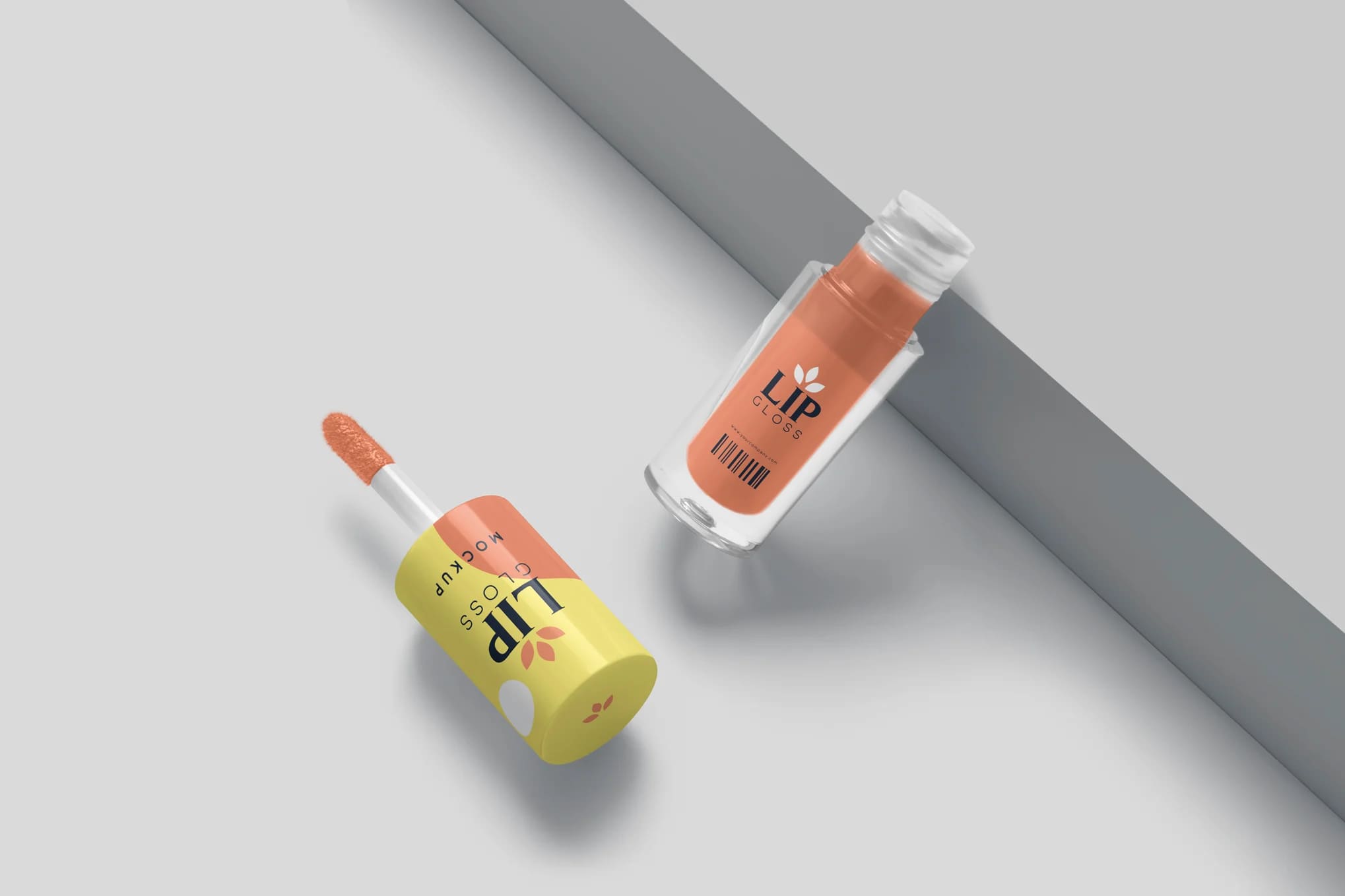
Color and Design: Communicating Brand Identity
Color palette and design elements anchor brand image. A single hue or pattern can prompt recall. I saw a brand whose teal tubes were spotted on a beauty blogger’s page. Within days, folks recognized that color from a distance. That synergy between color choice and brand vibe fuels growth.
The Psychology of Color in Packaging Design
Color triggers emotions. A warm pink might feel cozy, while a bold red exudes passion. I recall a brand that replaced a standard black accent with deep navy. Sales spiked because that shade felt more approachable. People interpret color in personal ways, but consistent usage fosters brand connection. Here is a small table that shows common color associations:
| Color | Common Associations | Possible Brand Position |
|---|---|---|
| Red | Passion, energy, excitement | Bold or youthful |
| Pink | Softness, romance, warmth | Gentle or affectionate |
| Blue | Calmness, trust, stability | Professional or dependable |
| Green | Nature, harmony, renewal | Eco-friendly or calming |
| Black | Sophistication, authority | Luxury or formal |
I mention that these associations are cultural generalizations. Market-specific research matters. Also, brand story might drive a color choice that challenges norms. Some sustainable brands use bright neon. That might seem off, yet it can still work if the messaging is consistent. People respond to authenticity more than strict color rules. If a brand passionately embraces a color and uses it across packaging and promotional materials, it becomes a signature. Repetition cements memory.
Integrating Logo and Personalized Fonts for Maximum Impact
Logos and text styles shape overall impression. I have seen carefully chosen typography that sets a mood before a shopper even reads the words. A brand that wants a classy tone might use elegant serif fonts. A bold brand might opt for thick sans-serif lettering. The key is clarity. If text is too ornate, potential buyers might miss brand name. One brand I worked with used an intricate script on a metallic background. Shoppers complained that text was unreadable. We revised it with simpler letters and boosted contrast. Readability must rank high.
A consistent logo helps unify product lines. I suggest placing it in a spot that catches eyes, maybe near the midpoint of a clear tube or angled across a cap. When brand owners keep that placement uniform, folks learn to spot it quickly. Some like to emboss or deboss logos for tactile interest. Others prefer a direct print. I find that each method can succeed, as long as it fits brand personality.
I include a small table of design tips:
| Element | Tip | Why It Helps |
|---|---|---|
| Logo Placement | Keep it visible at key focal points | Improves brand recall |
| Font Selection | Pick legible styles with strong contrast | Reduces confusion |
| Color Pairings | Use combos that complement brand vibe | Creates visual harmony |
| Space Management | Leave enough blank area | Gives eyes a clear resting spot |
| Consistency | Apply same approach across product lines | Builds reliable brand identity |
When brand owners align color, shape, and messaging, the packaging moves from simple container toward a branded statement. I feel that such synergy fosters stronger shopper loyalty. People get a sense of unity and that leads them back for repeat buys.
Personalization: The Ultimate Branding Tool?
Do you want packaging that speaks directly to customers? That notion can stir up excitement.
I combine personal touches, like engraved names or color-coded variants, that create deeper bonds. Clients feel special.
The Power of Personalized Packaging
I recall a brand that printed client names on each limited-edition tube. Buyers shared snapshots on social media. That technique boosted word-of-mouth. People cherish items that seem tailor-made. By offering small custom details, brands show they appreciate each user. I remember seeing how limited runs with user-selected fonts or color combos added a sense of exclusivity. A friend tried that approach with a short-run lip gloss batch for a local event. Attendees spotted tubes with event logos plus attendee initials. It created a keepsake quality.
Below is a small table that shows some personalization approaches:
| Method | Advantage | Example |
|---|---|---|
| Name Printing | Creates personal attachment | Names or initials on tube labels |
| Custom Colors | Matches user mood or style | Brand offers custom hue selection |
| Engraved Caps | Adds premium finish | Laser-etched brand motif or pattern |
| Themed Artwork | Marks special occasions | Seasonal designs for holidays |
| Limited Editions | Fosters exclusivity | Batch numbers or unique packaging art |
I understand that production logistics can become complex. Smaller runs might cost more. However, brands can balance that with premium pricing or special promotions. People often pay extra for unique features. Also, social media promotion can offset that investment. Personalization can attract new eyes. Someone sees a friend’s name on a tube, asks about it, then visits your shop. It’s a marketing loop that can pay off.
Successful Example of Personalized Lip Gloss Tubes
My favorite case study involves a local influencer who partnered with a packaging firm. She let her followers vote on designs, then each design was assigned a set of user-submitted quotes. She included those quotes on the side of each tube. People loved reading short uplifting phrases from real fans. That intangible sense of community boosted brand loyalty. She sold out quickly. I observed how that tactic built emotional connections. Rather than generic images, each item felt personal.
Some brand owners fear that personalization might complicate distribution. I advise them to plan carefully. Fulfillment systems should handle specialized orders. Possibly restrict personalization to short-run capsules or VIP lines. That helps manage supply without overextending resources. If done properly, personalization can become a powerful advantage that distinguishes your brand among countless competitors. People enjoy feeling seen. That factor can drive repeat sales.
Innovation and Trends in Lip Gloss Tubes?
Do you ever wonder if your packaging might lag behind modern styles? That worry can block brand growth.
I have noticed that new materials and fresh ideas continue to arrive. It’s wise to keep an eye on current developments.
Emerging Trends and Innovations
Technological advances have opened fresh possibilities. Airless containers keep formulas fresher. LED-lit caps add glamour in dim settings. Some brands experiment with sensor-enabled tubes that track usage. That might seem futuristic, but a segment of buyers appreciates novelty. My neighbor tested a prototype with a small mirror attachment. She brought it on nights out. It helped her reapply gloss in low light. Word spread among her circle. Features that solve small problems tend to attract interest.
I also see interest in hybrid containers. Some combine lip gloss with lip balm in a dual-chamber unit. That approach merges convenience with eye-catching design. People sometimes enjoy multi-use packaging that simplifies daily routines. On a more whimsical side, I’ve glimpsed color-shifting exteriors that change hue under sunlight. That playful element can entice certain demographics. Others might appreciate interactive packaging, like puzzle-style caps or hidden compartments. The sky’s wide if you match brand style with these new concepts.
Below is a table summarizing fresh ideas:
| Innovation | Benefit | Target User |
|---|---|---|
| Airless Chambers | Longer shelf life | High-end formulas |
| LED Caps | Trendy style, practical in low light | Party-goers, evening events |
| Sensor-Tracking | Usage data for reorders | Tech-savvy crowd |
| Dual-Chamber Designs | Combines multiple products | On-the-go individuals |
| Color-Shifting Exteriors | Interactive fun element | Younger consumers or novelty fans |
I believe not every brand must chase every innovation. Each choice should reflect brand personality. If your brand exudes playful energy, a color-shifting gimmick might fit. If you target a professional segment, an airless container might signal a focus on product integrity. Understanding audience needs is key. Perhaps your brand values minimalism, so those bells and whistles might be distracting. Instead, you might opt for a refined shape with a subtle new closure mechanism.
How to Stay Ahead in the Packaging Game
I often keep track of cross-industry developments. Trends in electronics packaging or food containers sometimes influence cosmetic packaging. Materials used for advanced coffee capsules could inspire new approaches for gloss tubes. Collaboration with packaging engineers or frequent visits to trade shows can spark new ideas. I also read specialized journals that highlight fresh materials or processes.
Networking with suppliers helps too. They might mention a newly developed resin that offers high clarity and strong chemical resistance. That can become a selling point for a brand that wants distinctive looks plus robust performance. Testing prototypes remains vital. Some ideas might fail real-world tests. Maybe an LED can malfunction if it gets wet. Possibly a color-shifting paint peels in hot climates. By running small pilots, one can fix issues early.
I recall a scenario where a brand introduced magnetic caps. They looked sleek, but testers found that magnets sometimes collected metal shavings in certain environments. That brand had to pivot quickly. They eventually used a safer design that retained some novelty without that hazard. That process taught me that not every trend suits every brand. However, staying informed prevents you from falling behind peers.
Conclusion
I see that iconic lip gloss tubes begin with brand clarity, material choice, and personal flair.